After learning a bit more about purrr and broom, I realized I could make my tie fighter plot code much more efficient. Tie fighters are a great way to show multiple regression coefficients in one figure, especially when the betas are the same independent variable but in multiple years or samples. Chris Muller and I use them (a lot) in our lead and crime paper.
For my own future reference, here’s how I’m making some tie fighter plots in the right to work paper with Alex and Vanessa.
library(data.table)
library(stringr)
library(tidyverse)
library(broom)
library(haven)
library(readstata13)
library(extrafont)
library(jjfPkg)
After loading the libraries I need, do a bunch of data munging (omitted here) and have a nice data.table with union membership by state and year, Democratic presidential vote share by state by year, and a bunch of control variables.
dt %>% head()## year state cov mem demvotes totalvotes demshare urbanshare
## 1: 1980 Alabama 22.6 19.5 636730 1341929 47.44886 60.03551
## 2: 1980 Alaska 33.9 29.7 41842 158445 26.40790 NA
## 3: 1980 Arizona 18.7 16.1 246843 873945 28.24468 NA
## 4: 1980 Arkansas 13.6 11.7 398041 837582 47.52263 51.58930
## 5: 1980 California 27.8 24.4 3083661 8587063 35.91054 91.29509
## 6: 1980 Colorado 18.9 15.2 367973 1184415 31.06791 80.62269
## blackshare medianfaminc collegeshare25 state_abb label
## 1: 25.614668 16458.29 12.24017 AL Alabama 1980
## 2: NA NA NA AK Alaska 1980
## 3: NA NA NA AZ Arizona 1980
## 4: 16.342765 14818.78 10.89445 AR Arkansas 1980
## 5: 8.499549 21689.09 19.47964 CA California 1980
## 6: 3.784021 21308.36 22.86845 CO Colorado 1980(There seems to be some missing data among the covariates for a few states. I’ll have to deal with that later.)
Now to make some tie fighters! I am interested in the betas (and the CIs) on union membership from regressions with Democratic vote share on the LHS with and without controls. I’ll run a separate regression for each election cycle.
I used to do this with a loop and such (a lot like the code I used to use in stata…). But broom and a bit of purrr makes this much easier.
# figure: tie fighter of betas on dem% = f(union%) over time
betas_unconditional <-
  dt %>%
  split(.$year) %>%
  map(~ lm(demshare ~ mem, data = .)) %>%
  map_dfr(tidy, conf.int = TRUE, .id = "year") %>%
  filter(term == "mem") %>%
  select(year, estimate, conf.low, conf.high) %>%
  mutate(conditional = FALSE)

betas_conditional <-
  dt %>%
  split(.$year) %>%
  map(~ lm(demshare ~ mem + blackshare + medianfaminc + collegeshare25 + urbanshare, data = .)) %>%
  map_dfr(tidy, conf.int = TRUE, .id = "year") %>%
  filter(term == "mem") %>%
  select(year, estimate, conf.low, conf.high) %>%
  mutate(conditional = TRUE)

betas <- rbind(betas_conditional, betas_unconditional) %>%
  mutate(year = year %>% as.numeric()) %>%
  as.tibble()
Basically, I take the data and:
- split it up by year
- run the regressions
- map it to a dataframe with
purrras I applytidyfrombroom(adding confidence intervals which aren’t in the base R regression output) - grab just the coefficient I care about (
mem) - and the columns I care about (year, betas, CIs)
- and add a variable to indicate which set of regressions (with or without covariates)
Then I stack the data and tibble it. Now, I have a nice data.frame (data.tibble) to make tie fighters with:
betas## # A tibble: 20 x 5
## year estimate conf.low conf.high conditional
## <dbl> <dbl> <dbl> <dbl> <lgl>
## 1 1980. 0.459 0.135 0.784 TRUE
## 2 1984. 0.756 0.463 1.05 TRUE
## 3 1988. 0.667 0.344 0.990 TRUE
## 4 1992. 0.507 0.161 0.853 TRUE
## 5 1996. 0.646 0.256 1.04 TRUE
## 6 2000. 0.969 0.564 1.37 TRUE
## 7 2004. 0.930 0.506 1.35 TRUE
## 8 2008. 1.14 0.735 1.54 TRUE
## 9 2012. 1.18 0.733 1.63 TRUE
## 10 2016. 1.02 0.577 1.45 TRUE
## 11 1980. 0.0699 -0.234 0.374 FALSE
## 12 1984. 0.446 0.238 0.655 FALSE
## 13 1988. 0.483 0.262 0.703 FALSE
## 14 1992. 0.315 0.0448 0.586 FALSE
## 15 1996. 0.498 0.194 0.802 FALSE
## 16 2000. 0.799 0.425 1.17 FALSE
## 17 2004. 0.877 0.511 1.24 FALSE
## 18 2008. 1.00 0.627 1.38 FALSE
## 19 2012. 1.18 0.740 1.62 FALSE
## 20 2016. 1.29 0.794 1.79 FALSEbetas %>%
ggplot(aes(x = year, y = estimate, color = conditional)) +
geom_point(position = position_dodge(width = 2)) +
geom_errorbar(aes(ymin = conf.low, ymax = conf.high),
position = position_dodge(width = 2), width = 1.5) +
geom_hline(yintercept = 0) +
scale_color_manual(values = c(burdred, burdblue),
labels = c("Unconditional", "Conditional")) +
xlab("Presidential Election Year") +
ylab("Estimated Effect of Union Membership \n on Democratic Vote Share") +
scale_x_continuous(breaks = seq(1980, 2016, by = 4)) +
theme_jjf()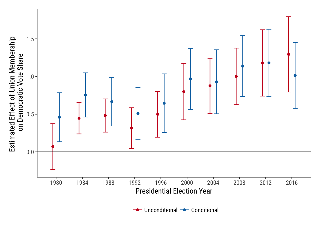
Not too much code and a really good looking figure.